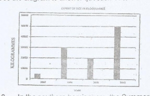
The diagram above represents the export of rice in Kilogrammes from Country X between 2007 and 2010.
What is the name of the diagram above?
a
Line graph
b
Bar graph
c
Pie Chart
d
Star graph
Explanation
Correct Option
bNo explanation available
Video Explanation
No video available
Post your Contribution
Share:
Discussions (0)
No comments yet
Be the first to comment