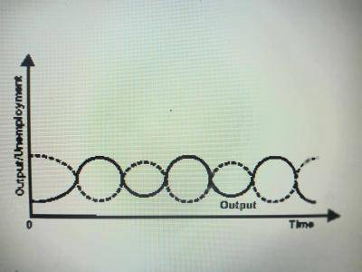
The diagram above represent
The dotted line in the graph above represent the upturn and downturn of the econonmy. Therefore, the diagram is cyclical unemployment.
Please don't post or ask to join a "Group" or "Whatsapp Group" as a comment. It will be deleted. To join or start a group, please click here


Contributions ({{ comment_count }})
Please wait...
Modal title
Report
Block User
{{ feedback_modal_data.title }}