a
a decrease in quantity supplied
b
an increase in supply
c
a decrease in supply
d
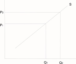
an increase in quantity
Explanation
Correct Option
dVideo Explanation
No video available
Post your Contribution
Share:
Discussions (1)

lankee22
5 years ago
the graph below is in relation to price but the answer chosen is in relation to a non price factor