a
a decrease in quantity supplied
b
an increase in supply
c
a decrease in supply
d
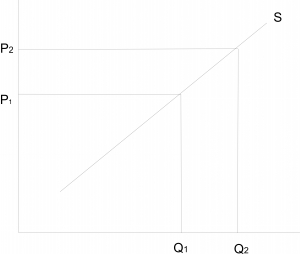
an increase in quantity supplied
Explanation
Correct Option
dVideo Explanation
No video available
Post your Contribution
Share:
Discussions (0)
No comments yet
Be the first to comment